Okay, so perhaps you can take Photoshop effects too far, but wouldn't you agree this shot is better than the plain image with a muddy gray background from a cell phone?
Friday, April 16, 2010

Saturday, August 09, 2008
Chinese Garden
Seeing this picture again reminded me of the opening ceremony of the Beijing Olympic games.
What I saw was a stunning display of beauty through replicated conformity.

What I saw was a stunning display of beauty through replicated conformity.
Tuesday, July 29, 2008
Okay, Yet Another Flickr Photo Album Viewer Test
After several dozen combinations, I think I've settled on the following for displaying the default sizes of flickr images in sets:
Monday, July 28, 2008
Pacific Coast
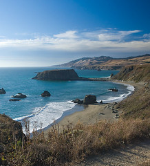
I've added the collection of pictures from the Pacific Coast online at flickr.
Click here for a slideshow.
Let me know what you think of this format.
Test of FlickrSlidr
Here is a test of the FlickrSlidr, depicting shots from Napa Valley:
The default view of pictures in Flickr is maximally 500px high by 500 px wide, what they call "Medium". There are many free viewers which allow you to show the original size, a full-screen size, or a scaled size of your chosing.
The challenge is showing the largest size in the hosting window, without forcing the user to scroll to see parts of the picture not on screen, and without zooming a low-resolution image into a larger space.
Wednesday, July 23, 2008
Personal Favorites - Fireworks
Here are some of my recent favorites:
For years, I struggled to get well-focused pictures of fireworks. For starters, it's dark, and you can't ask the subject to re-do a shot. Then there are the bugs, the soft ground, and the unpredictable timing of the shots. After learning a few techniques, I grew to enjoy the process. Here are some tips: The most important aspect of a good fireworks shot is a long exposure and high depth of field. This requires you to use a tripod and ignore the program settings of the camera. By using the "bulb" feature and holding the exposure from the time you hear the launch until the completion of the burst with a handheld shutter release, you create a "painting" of the entire shell's trajectory. You can also use a card (or even your hand) to cover the lens between shells, if you wish to combine multiple explosions in a single frame. For example, one of the above shots was a 24-second exposure using this technique. Don't check every image you shoot -- you simply won't have the time, and you'll likely miss the next few shells. Enjoy the variable of luck in good firework shots; you have no idea once you commit to the exposure how impressive the result will be. Finally, calibrate the camera position once, and keep shooting. Expect that no more than one in five shots will be a keeper.
Link to full-screen slideshow: http://picasaweb.google.com/here.is.rich/FavoritesFireworks/photo#s5118832334310736962
Sunday, August 26, 2007
Hiking Vista
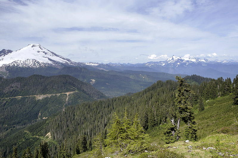
One of many shots from the Dock Butte Trail in Washington state, August 2007.
More shots availalbe here: http://picasaweb.google.com/here.is.rich/DockButteTrail
Monday, August 06, 2007
Odd Memorial
+copy.jpg)
+copy.jpg)

About the Pictures
I shot these two photographs just minutes and a few feet apart on the Deception Pass bridge in Washington state.
Why I choose these - Philosophically
The subject of suicide is something for which I have no expertise nor desire to become acquainted. When I took this photograph, I assumed that there was no foul play, nor a loose correlation in which the surviving relatives or friends chose this spot for its beauty. Upon seeing the memorial, I felt saddened by the thought of a stranger's untimely loss. As I thought about it some more, there were elements of this particular memorial that struck me as odd. First, I was struck by the age. The deceased was less than 28 years old at the time, younger than I am today. At age 28 most Americans have finalized their academic studies, engaged in a career (or two) of their choosing, and have either begun or have sought the start of a new family. For many, that age is one of confidence, of status, of knowing one's place in society, and accepting the attendant responsibilities. At 28, at the brink of a new century, I saw the world as complex and beautiful. I wish the circumstances had existed for the deceased to have seen the world from a similar vantage point. Gazing to the horizon just steps away I captured the blue rippling water lapping against the islands below. I wonder, did this person catch this perspective?
Another odd aspect of the memorial, which is the principal reason for my photographing it, was the chosen point of view for the plate. Whomever looks at this memorial must look in the very same direction as the deceased did in his final moments. Is this what a family member would choose to see? As you read the memorial, you must confront the unease of looking down at the perilous emptiness below, which is anything but comforting. Perhaps then, this memorial is more than sentimental; it is instructive, cautionary. Its placement warns those that lean over the edge that death can happen here. More importantly, its chosen location might offer someone the chance to look slightly away, to see the beauty of the nearby vista, and conclude that one's view of life can improve dramatically with a slightly different perspective.
Less Information, More Meaning
+copy.jpg)
About the picture
This picture was originally a digital color photograph I took at a nearby state park, which I later transformed into a blue-cast duotone image in Photoshop. The scene was natural beauty, punctuated by the odd way in which the tree in the foreground appears to bend at a right angle, wrapping itself about the skyline of the background.
Why I chose this - Technically
When converting to a duotone image, I actually subtracted information from the scene. Gone are the various colors of green, brown and intense yellow that dominated the image. Instead there are only gradations of this surreal blue. The original purpose of the conversion was to hide overexposure of the sunlight in the picture. By converting to grayscale, I could selectively reduce the intensity of the white-yellow light of the bright midday sun and compress the contrast range in the image. To my surprise, taking the step to lessen my exposure mistake actually revealed a better image.
Why I chose this - Philosophically
In an age of rapid, easily-accessible information, people have a tendency to believe that the more information we have presented before us, the more complexity we can appreciate. However, a photograph like this shows that by effectively removing information, we are given intellectual freedom to appreciate aspects of a scene that might have gone without notice. We are not drawn simply to the horizon, to gaze at a faraway mountain or landmark; we are steadfastly focused on the foreground, and the many strange ways in which the leaves can take form and the branches can twist. The paradox of beauty in nature is that it can be both irregular and yet common; here the geometry of trees is both instantaneously recognizable yet bizarrely asymmetric. Without the color reduction, such an appreciation of texture and shape might be more subtle, and thus easily overlooked.
This concept in my opinion extends beyond graphic art. One can selectively "filter" and reduce the amount of information in a given communication, and sometimes come away with a greater appreciation of the underlying message. The next time you receive an e-mail message from a supervisor, filter the message for the number of times the word "I" appears instead of "we"; or alternatively, consider whether the focus is on what he or she feels or what he or she observes. Through simple tabulation, discarding the actual verbs and distracting adjectives, you can learn about the motivation behind the message. Such creative filtrations, for example, might expose the underlying emotional basis that any effective reply should address, instead of the mundane detail that might first come to mind having read the note literally.
Subscribe to:
Posts (Atom)